
AnythingLLM Brand Guidelines
Logo kit and brand guidelines for use.
AnythingLLM wordmark
The primary AnythingLLM logo combines our symbol and word mark into a single lockup. This version should be used by default across most brand applications. Monochrome usage is preferred and should always use the approved brand colors defined below. Choose the version that provides the greatest contrast with its background.



Wordmark Don'ts
To maintain a consistent and recognizable brand, the AnythingLLM logo should only be used as provided. Never alter, recreate, or decorate the logo.
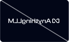
do not flip
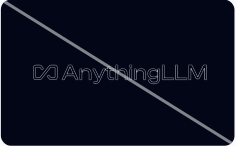
do not outline
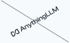
do not tilt
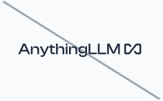
do not reverse the icon & word mark
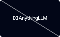
do not narrow width
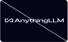
do not widen
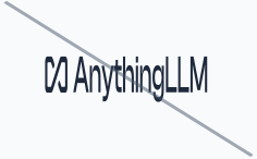
do not stretch the height
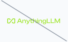
do not use unofficial colors
AnythingLLM Symbol
The standalone symbol is a secondary logo intended for compact layouts where the full logo would be difficult to read. Use it for navigation, favicon assets, small UI surfaces, merchandise, logo grids, and other space-constrained applications. The symbol should not replace the primary logo when sufficient space is available.




AnythingLLM icon
When representing AnythingLLM as a company—such as social media profiles, application icons, avatars, or interfaces requiring a rounded-square treatment—the official app icon may be used. Always use the approved icon artwork with an appropriate corner radius. Do not crop, resize, or modify the artwork within the container.


Colors
Color is an important part of the AnythingLLM identity. Our palette is designed to remain accessible, consistent, and familiar across both product interfaces and marketing materials. AnythingLLM supports both Light Mode and Dark Mode.
- Light Mode uses the Tailwind Slate palette.
- Dark Mode uses the Tailwind Zinc palette.
Slate
Slate 900
RGB 2, 6, 23
#020617
Slate 50
RGB 248, 250, 252
#F8FAFC
Slate 50
RGB 248, 250, 252
#F8FAFC
Slate 800
RGB 30, 41, 59
#1E293B
Zinc
Zinc 900
RGB 9, 9, 11
#09090B
Zinc 50
RGB 250, 250, 250
#FAFAFA
Zinc 50
RGB 250, 250, 250
#FAFAFA
Zinc 800
RGB 39, 39, 42
#27272A